


UI Design
5 STEPS TO IMPROVEMENT: UI DESIGN FOR THE WORKPLACE – Part.2
2025.05.20
Hello, we are the design team at Third Scope Inc.
In Part 1 of this series, we explored often-overlooked UI improvement points and introduced key design considerations to implement before development begins.
Now in Part 2 of our “Practical UI Design in the Field” series, we examine the crucial shift from visual aesthetics to actual usability—a transition essential for creating user-friendly, satisfying experiences.
This article focuses on the UI improvement process through user testing and data-driven validation, which becomes vital at this stage.
Table of Contents
- UI Design Doesn’t End at Launch
- 1. Viewing Through the User’s Lens – Designing Research to Uncover Issues
- 2. Designing a Usability Test
- 3. Observing User Behavior Through Logs
- 4. Pitfalls in Hypothesis Testing & A/B Experiments
- 5. Creating a Feedback Loop with Stakeholders
- Coming Next: Design for Reusability and Scalability
Disclaimer
The approach we present here is one of many possible paths.
Design has no single “correct” solution—the best approach depends on your specific goals and context.
We hope this article provides valuable perspectives and inspiration for your projects.
UI Design Doesn’t End at Launch
Common issues often emerge right before or after release:
- “It looks polished, but it’s hard to use.”
- “Users aren’t behaving as expected.”
These challenges typically stem from insufficient user-centered validation.
- The period around implementation is when real issues become apparent.
- Strong visual design alone does not guarantee a good user experience.
In this article, we present a five-step validation process to enhance user understanding and guide effective UI improvements.
1. Viewing Through the User’s Lens – Designing Research to Uncover Issues

The first step in improving UI is to ask:
“Where are users getting stuck?”
To answer this effectively, we recommend combining qualitative and quantitative research, chosen based on your objectives.
What is Qualitative Research?
This method reveals why users behave certain ways and how they feel.
Through interviews and usability tests, we uncover emotional triggers and pain points—collecting insights as non-numerical, descriptive data.
Example question: “What made you hesitate on this screen?”
🧠 Tip: Control the level of abstraction in your questions.
Instead of “How was this screen?” ask something specific like “Was any part of the checkout flow confusing?”
What is Quantitative Research?
This approach uses numbers and behavioral patterns to visualize user actions.
Surveys, analytics logs, and click-through rates help paint the complete picture and reveal trends.
Example:
- “This page has a high bounce rate.”
- “This call-to-action has lower clicks than others.”
🧠 Tip: Larger sample sizes in quantitative data yield more reliable behavior patterns.
🍥 When to Use Which:
- Begin with quantitative research to identify where problems exist.
- Follow up with qualitative research to understand why they occur.
This “numbers first, then conversations” strategy leads to more actionable and practical UI improvements.
🐰 Bonus Tip: Combining Surveys with Heatmaps
Cross-referencing perceived usability issues with heatmap activity reveals gaps between what users say and what they actually do.
💭 Real Case Example
Quantitative data revealed frequent user drop-offs at the first screen.
Follow-up interviews showed users were unclear about the site’s purpose, leading to revisions in both copy and layout.
2. Designing a Usability Test

After identifying problems, it’s time to test your hypotheses.
This is where well-structured usability testing proves invaluable.
Your test plan should specify:
- Tasks – e.g., “Find a product and add it to the cart”
- Observation points – Where do users hesitate or get lost?
- Success criteria – What defines a completed task?
A small group—3 to 5 users per round—often suffices.
Iterate and refine as you progress.
🐰 Remote Testing Tools
- Lookback – Excellent for live observation
- Maze – Lightweight, perfect for A/B tests(See: Simple Prototyping Tests with Maze)
- UserTesting – Real-time feedback across websites, apps, and prototypes
🍥 Recommended Reads:
- Running Usability Tests with Lookback
- Intro to Maze for Prototype Testing
- Using UserTesting with Figma Prototypes
💭 Avoid Biased Questions
Skip leading prompts like “Don’t you think this button is unclear?”
Design tests that encourage users to act naturally, allowing friction points to emerge organically.
3. Observing User Behavior Through Logs
Log analysis reveals what users actually do.
Essential tools and their applications:
- GA4 (Google Analytics) – Tracks user paths, bounce rates, and traffic sources
- Hotjar / Clarity – Heatmaps and session replays for visual analysis
🐰 Hint: Reverse-Engineer Improvements from Exit Points
Example: High form abandonment → simplify fields or break into steps.
💭 Form Fixes Can Boost Conversions
When logs show users abandoning manual address input, adding auto-fill and clear placeholder hints can significantly lift conversion rates.
4. Pitfalls in Hypothesis Testing & A/B Experiments

While A/B testing is powerful, poorly designed tests can identify false winners.
Essential elements:
- Variable control (e.g., modify only button copy)
- KPI definition (e.g., click-through rate, conversion rate)
- Testing duration (minimum 1–2 weeks)
🐰 Caution: A/B Tests Can Mislead
A seemingly winning UI might be a statistical fluke with low traffic—beware the “winner’s fallacy.”
💭 Start Small with Micro Tests
Before scaling up, test individual components, evaluate results, and iterate for more reliable outcomes.
5. Creating a Feedback Loop with Stakeholders
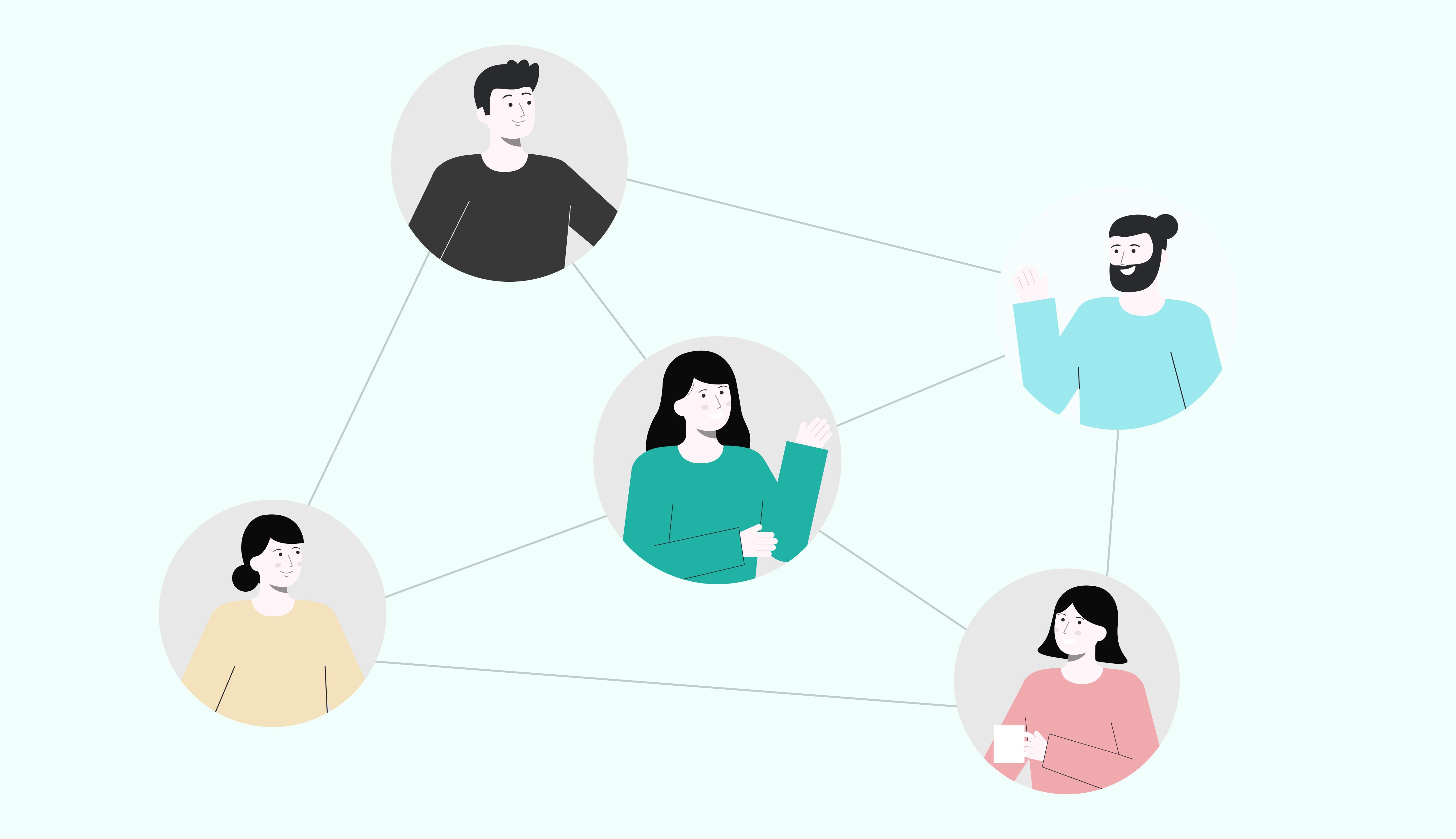
Don’t let improvements end with “Looks good” or “Didn’t work.”
Build a sustainable feedback loop for lasting impact.
Examples:
- Share Reports – A single page suffices. Combine visuals, metrics, and user quotes.
- Speak in Plain Language – Replace jargon with relatable terms.Example: “30% of users dropped off here” → “This part is like a confusing intersection.”
🐰 Tip: Integrate Test Results into Design Reviews
Support design suggestions with validation data to shift feedback from opinion to evidence.
💭 Leverage AI Summaries for Feedback
Use AI-generated summaries and meeting transcripts to maintain active feedback loops—particularly valuable for small teams.
What did you think?
This article explored the UI improvement process during the validation phase—when products evolve from merely “looking good” to delivering exceptional experiences.
Coming Next: Design for Reusability and Scalability
In our final installment, we’ll explore:
- How UI evolves with product growth
- How to build systems for continuous improvement
We’ll examine “designing for redesign” and share strategies for sustainable UI development.
At TS (Third Scope), our design team partners with clients across industries, offering:
- New product design
- Website renewals
- UI/UX improvements
Third Scope Inc. | A Tokyo-based tech company combining design and engineering
We’ll continue sharing designer-focused content here on Note.
If you’re interested, please follow us and stay tuned.
Thank you for reading—
We welcome your thoughts and feedback.
See you in the next article.
— ThirdScope Design Lab