Hello there! We’re the UI design team at ThirdScope, offering creative consultancy in communication design across the UK, Japan and Singapore. Having guided projects from inception right up to the eve of release, we’ve often stumbled upon those “if only we’d spotted this sooner…” moments—small UI slip-ups that can make a big difference.
In this article, we’ve gathered the most practical UI tips uncovered on real-world projects, organised into five key categories. Each tip is instantly applicable to your next project, so do feel free to put them straight into practice.
Table of Contents
- 1. Conveying Context – Communicating Status and Surroundings
- 2. Clear Copy and Structure – Thoughtful Text and Information Architecture
- 3. Preventing User Errors – Designing for Clarity
- 4. Delightful Interactions – Motion and Feel
- 5. Growing the UI as a Team – Guidelines and Collaboration
- In Summary
- Next time: Spotting Hidden UI Landmines
Disclaimer
The suggestions here represent just one approach or set of examples. There’s no single “correct” design—what works best depends on your goals and context. We hope these ideas spark fresh thinking and help you spot those overlooked opportunities.
1. Conveying Context – Communicating Status and Surroundings
1.1 Show Progress with a Step Bar
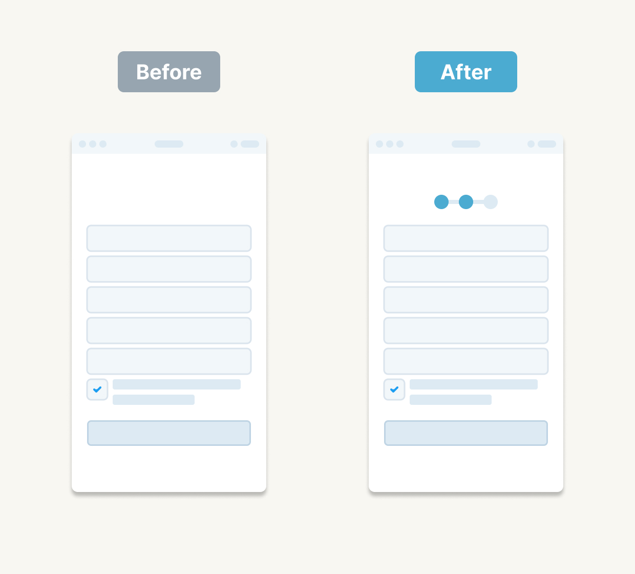
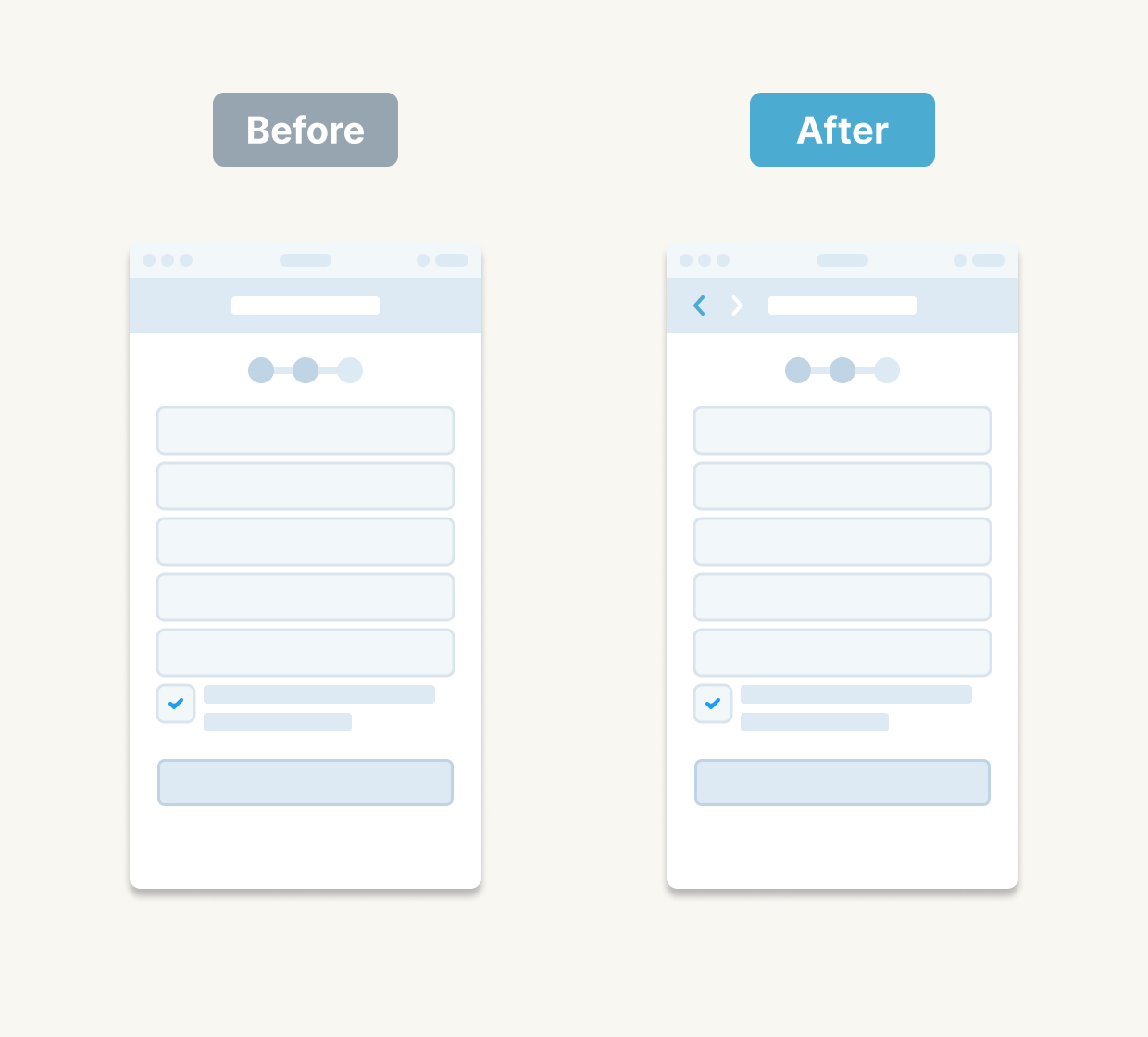
Highlight where users are and what’s next. Even in a simple form, indicating “Step 2 of 5” can dramatically lower drop-off rates.
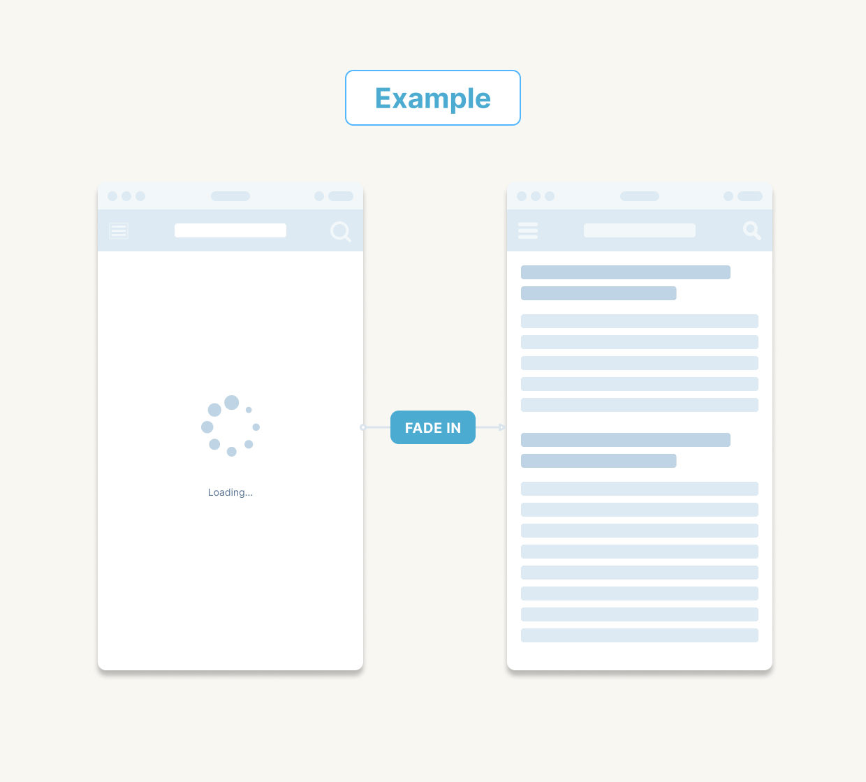
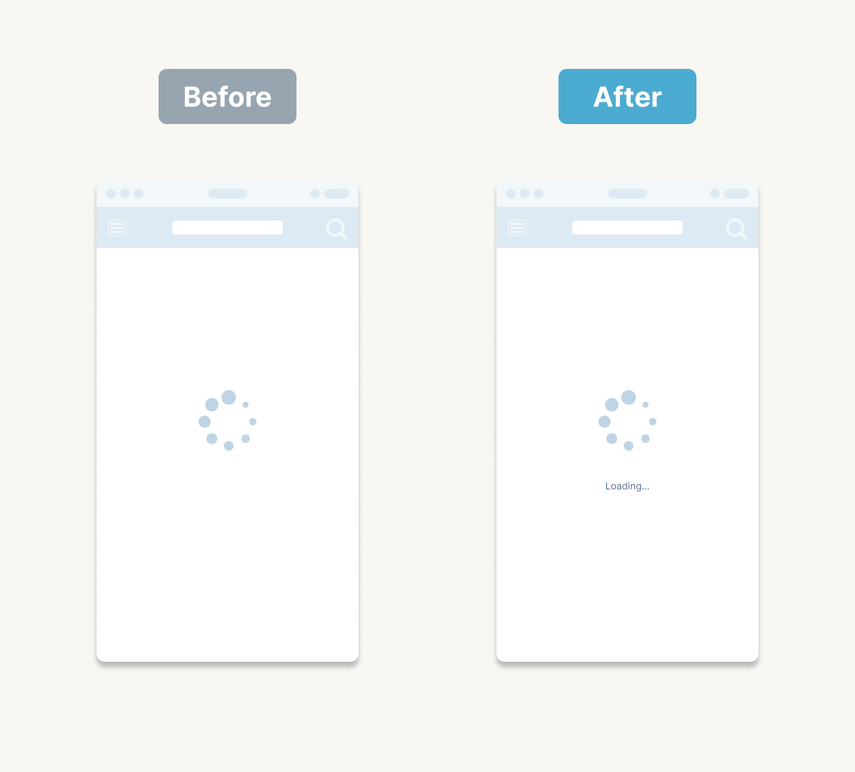
1.2 Make Loading and Completion Obvious
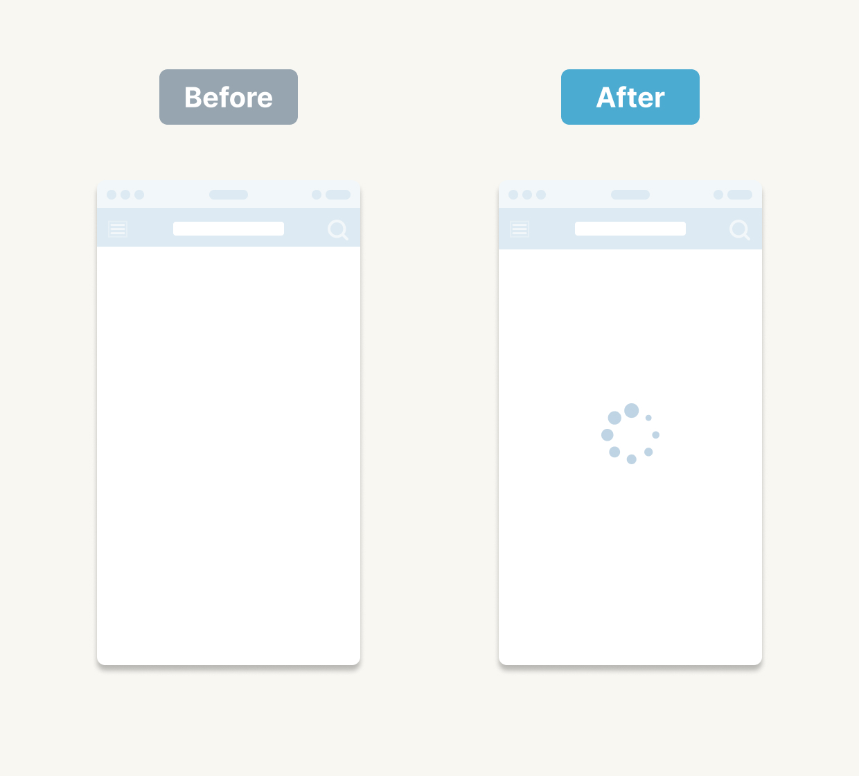
Display a spinner or progress animation while things are loading, and show a clear “Done!” message when tasks finish. This reassurance keeps users comfortable and confident.
1.3 Dim the Background Behind Overlays
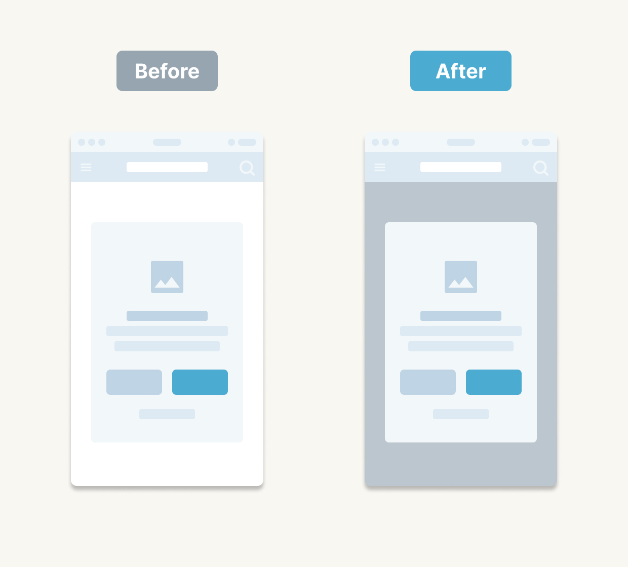
When a modal or overlay is open, darkening the underlying screen helps users focus on the current task and avoids confusion.
1.4 Use AI for Anomaly Detection
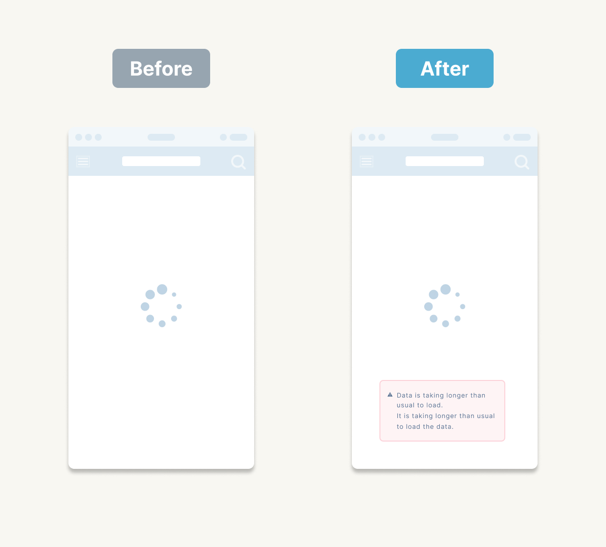
Modern AI tools can spot unusual states—say, an API delay—and surface friendly messages like “This is taking a little longer than usual.” It’s a fresh way to boost user trust.
2. Clear Copy and Structure – Thoughtful Text and Information Architecture
2.1 Be Specific with Button Labels (“Next” → “Review Your Details”)
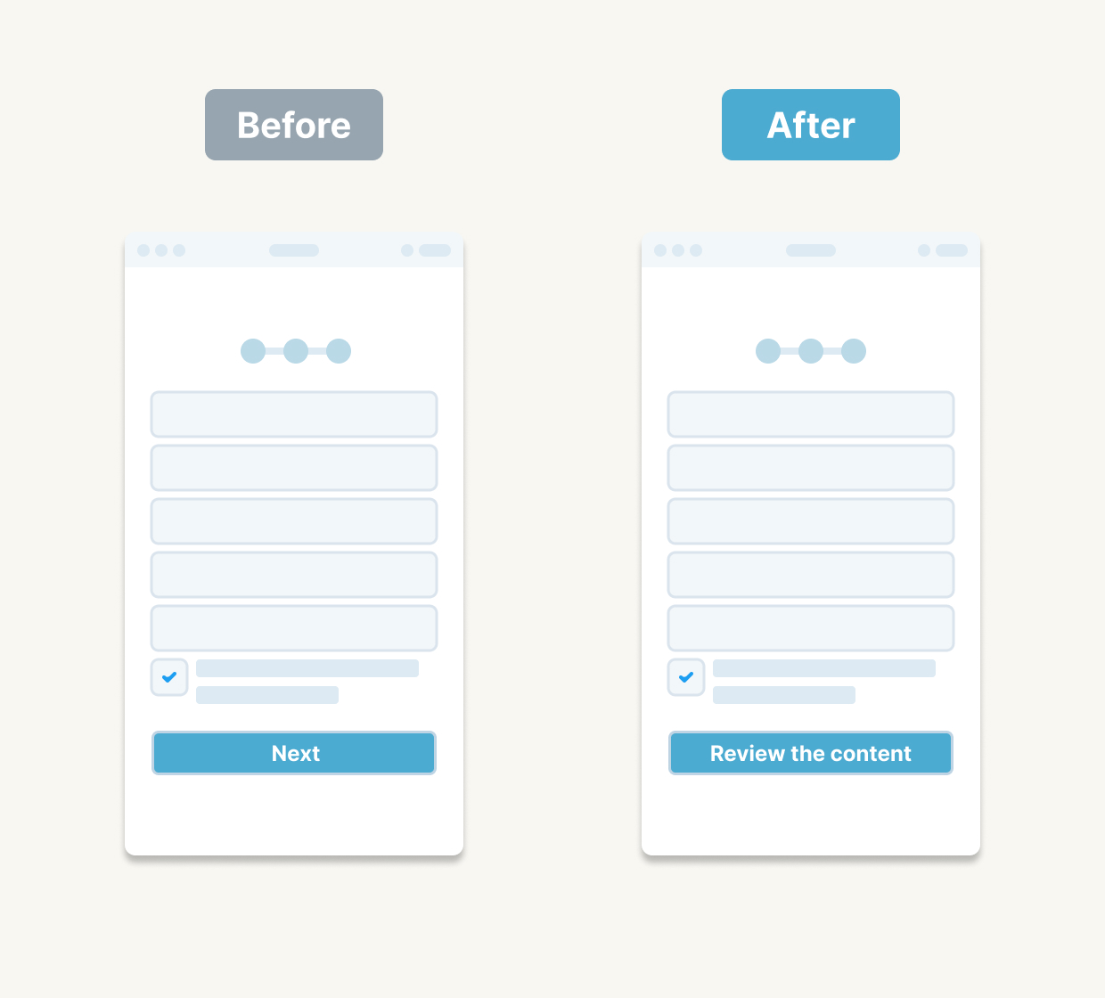
Words matter. “Review Your Details” gives users confidence compared to a vague “Next.”
2.2 Lead with Verbs in Action Names

Include verbs to clarify intent—“Save Settings” rather than just “Save.”
2.3 Turn Empty States into Invitations
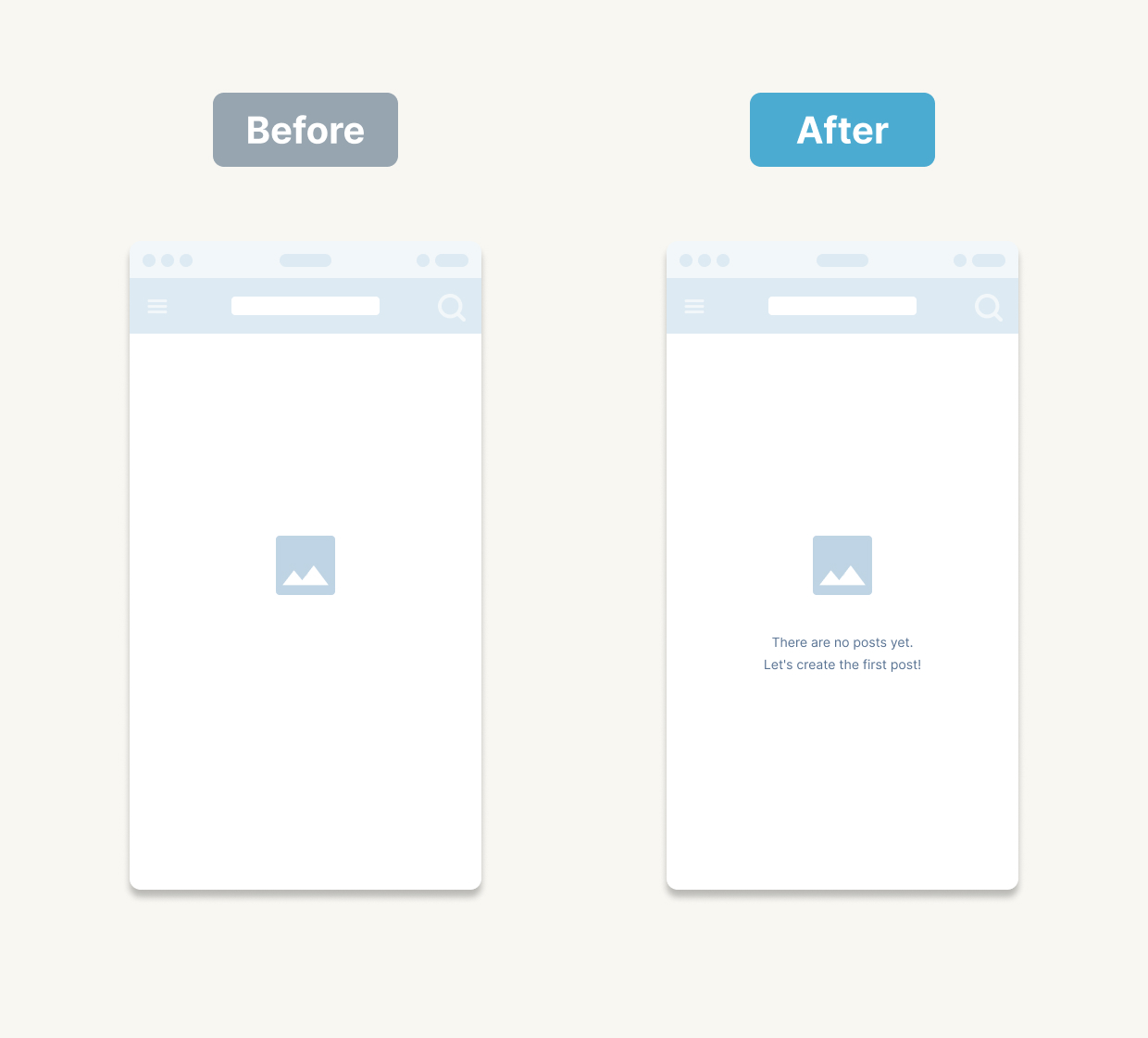
Instead of “No posts yet,” try “No posts yet—why not make the first one?” This gentle nudge keeps the experience upbeat.
2.4 Design for Screen-Readers and Voice UI
Consider how your copy reads aloud and structure it for assistive technologies. Accessibility is ever more essential.
3. Preventing User Errors – Designing for Clarity
3.1 Safeguard Save vs Delete
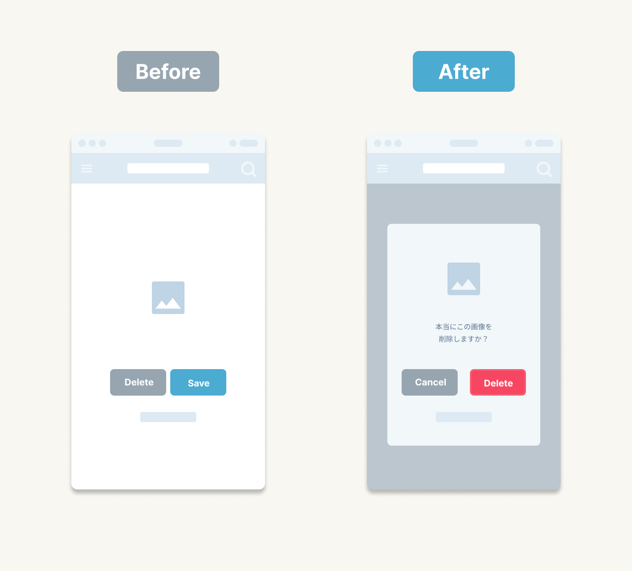
Don’t place “Save” and “Delete” side by side. Use distinct colours or add a confirmation dialogue to avoid costly mistakes.
3.2 Make Toggles Intuitive
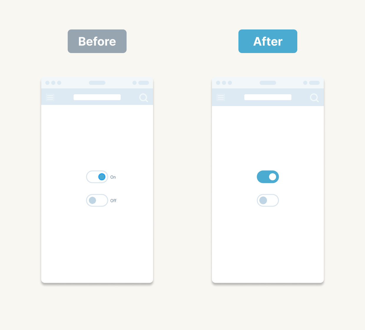
Rather than labels, rely on clear visual cues: muted grey for off, your accent colour for on. Users will instinctively grasp the state.
3.3 Offer an “Undo” Path
If someone mis-clicks, an easily accessible “Undo” link or button can save the day and reduce frustration.
3.4 Craft Helpful Error Messages
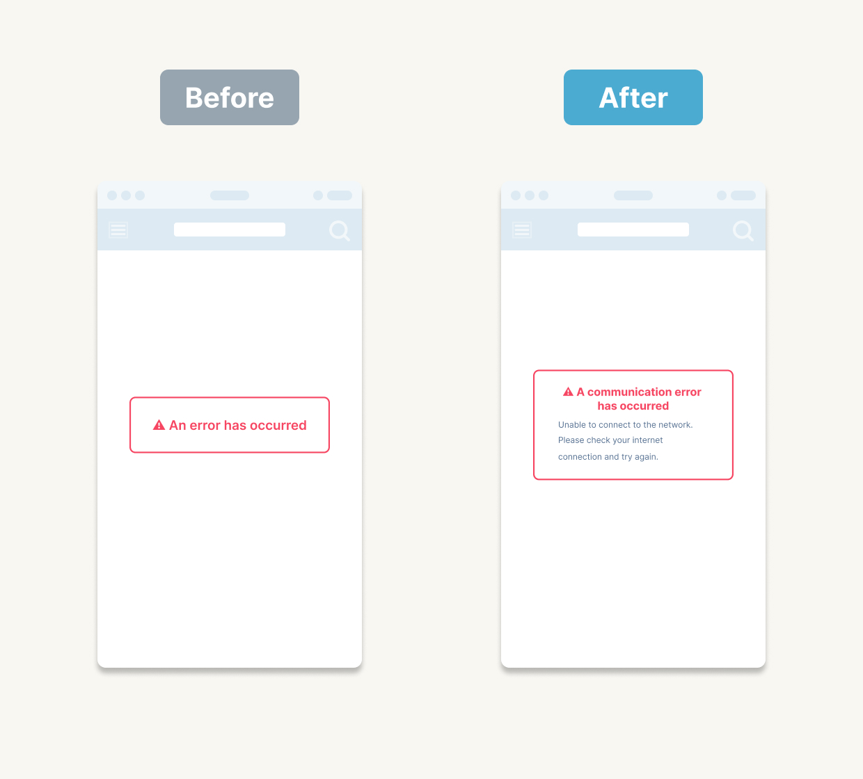
Pair the reason (“File too large”) with the next step (“Try compressing it or choose a smaller file”). Users appreciate guidance over cryptic codes.
4. Delightful Interactions – Motion and Feel
4.1 Add Subtle Page-Transition Animations
A gentle fade or slide eases abrupt changes and makes your interface feel polished.
4.2 Introduce Hover Effects on Buttons
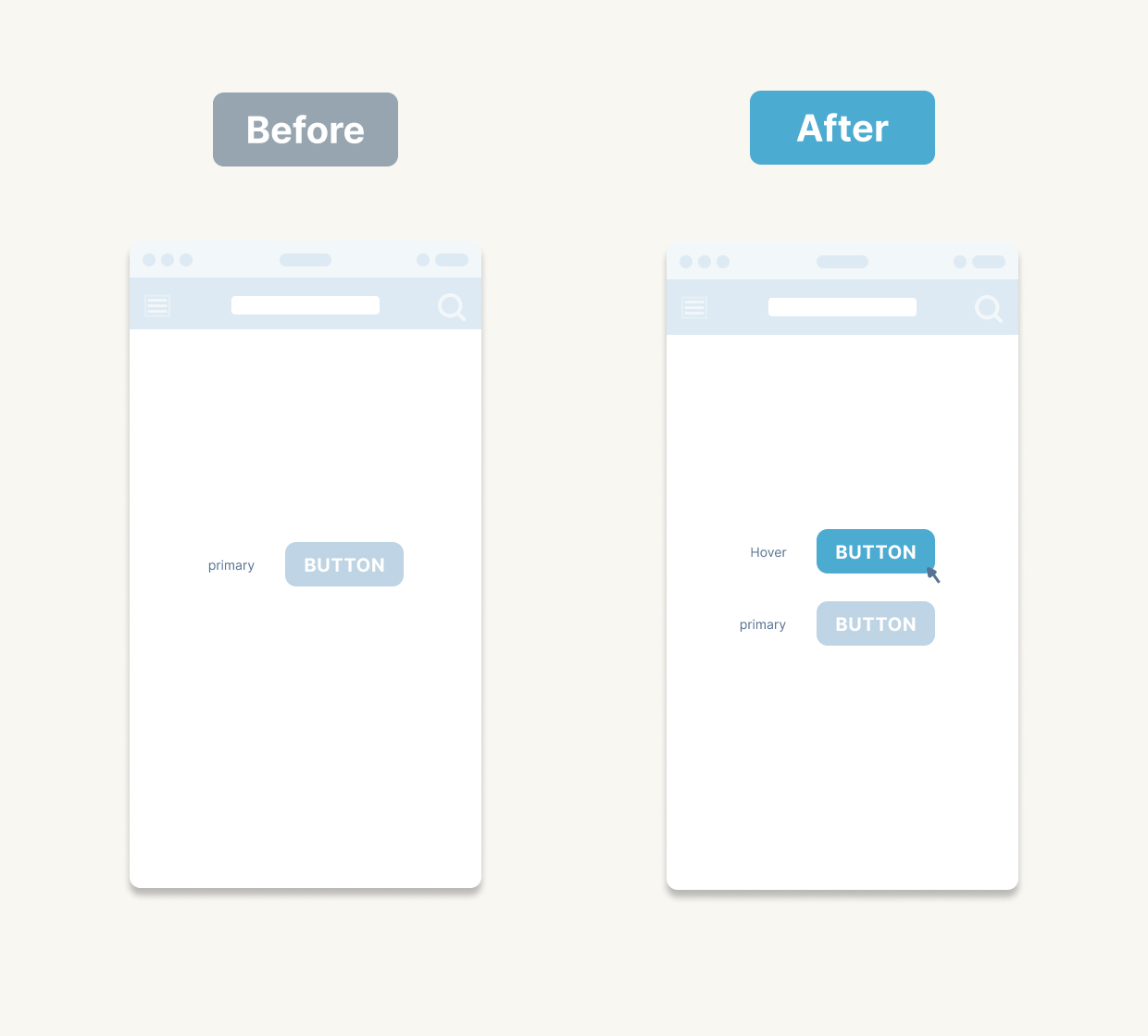
Even a slight hover response gives users tactile feedback and enriches the interaction rhythm.
4.3 Combine Motion with UX Copy
Display “Hang tight, loading…” alongside a smooth animation to soften the wait and keep users engaged.
5. Growing the UI as a Team – Guidelines and Collaboration
5.1 Establish Component Naming and Tokens
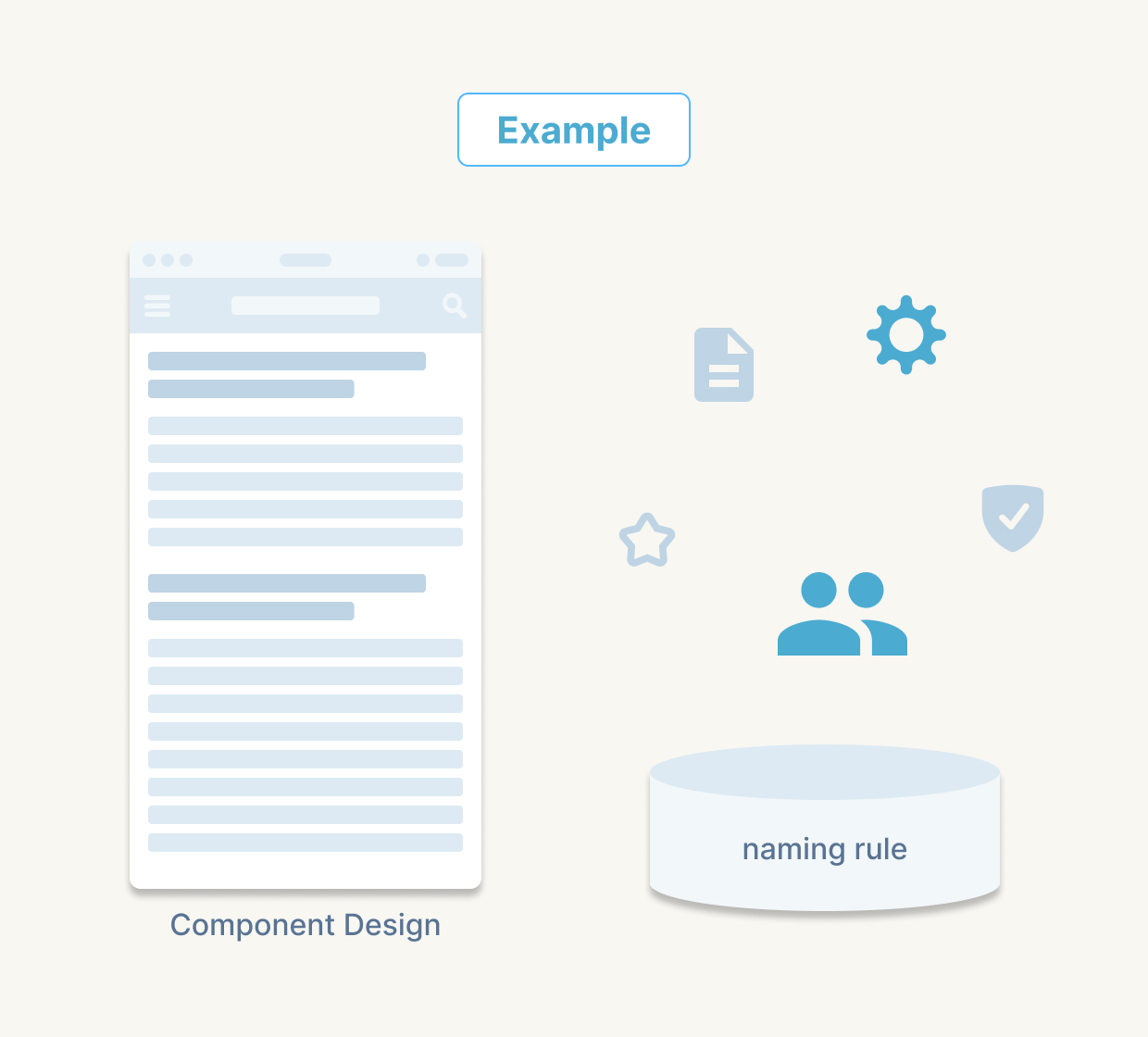
In Figma (or your tool of choice), name buttons like Button/Primary/Enabled or Button/Secondary/Hover. Maintain a shared style-token library—think colour-bg-default or spacing-xs—so updates and theme changes roll out seamlessly.
5.2 Automate Reviews with AI and Git Integration
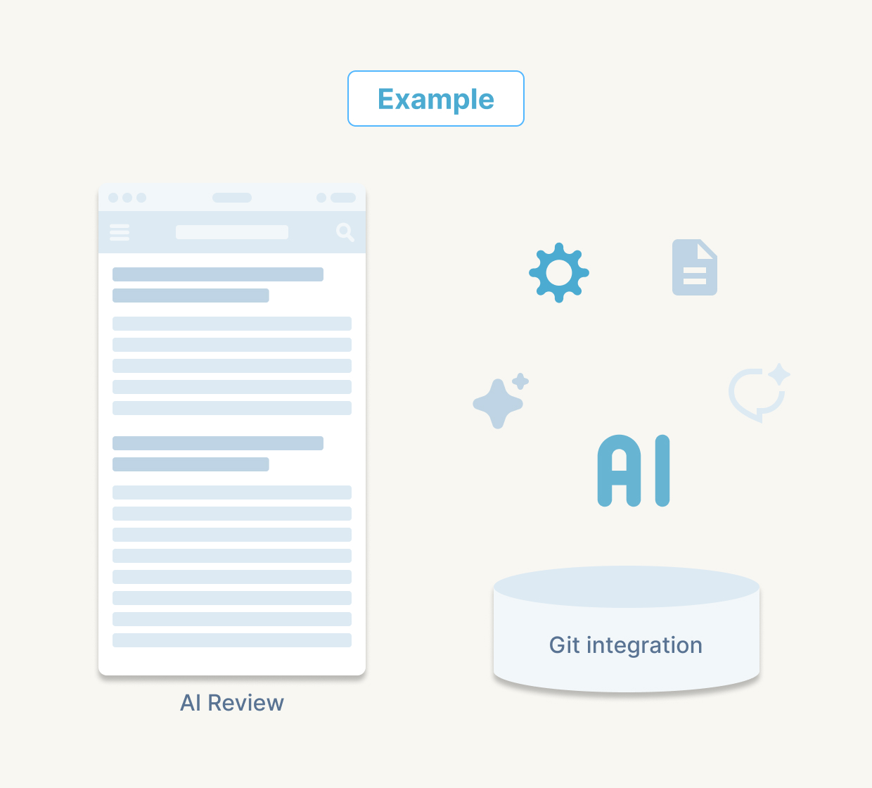
Plugins can flag contrast issues or inconsistent styles in Figma, while Storybook-based bots in your Git workflow can catch UI diffs before they land. This ensures everyone ships the same high quality.
When “anyone can achieve the same standard,” you preserve consistency, scalability and maintainability—especially vital when multiple teams and projects are involved.
In Summary
We’ve selected these five categories of essential tips—from status indicators to team governance—drawn from years of cross-industry practice. We hope they become your go-to checklist for crafting smoother, more reliable UIs.
Next time: We’ll explore how to spot and defuse hidden UI landmines through usability evaluations and user-testing insights—so you can turn “it looks good but feels off” into tangible fixes.
Stay tuned, and happy designing!
— ThirdScope Design Lab