Hello,
We are the design team at Third Scope Europe Inc..
In our daily work with UI and UX design,
we often find ourselves asking:
“Why is this button being clicked?”
“Why is this user flow causing drop-offs?”
The answers to these questions often lie in human psychology.
In this article, we’ll introduce 7 principles of UX psychology that you can immediately apply to your daily design work.
Each is based on unconscious user behavior and thought patterns—and can become powerful tools to enhance your product’s user experience.
Table of Contents
Disclaimer
The content introduced in this article represents just one approach or example.
There is no single “correct” answer in design—what’s optimal can vary depending on the purpose and context.
We hope this article serves as a helpful reference or a source of inspiration for your own thinking.
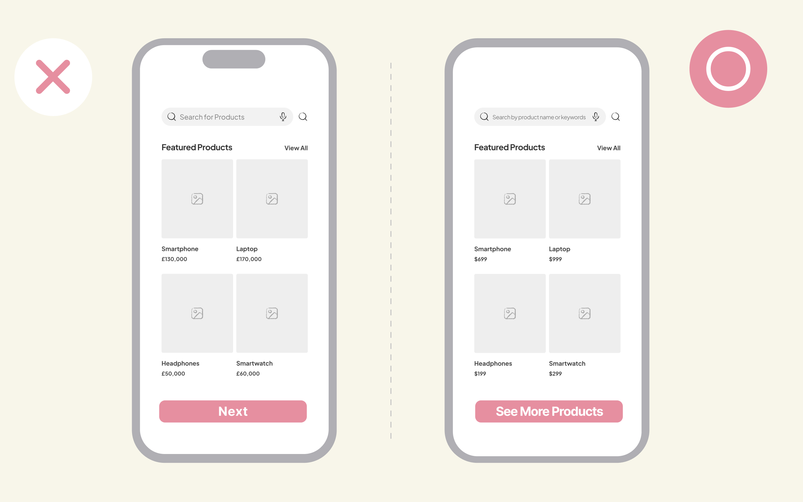
1. Hick’s Law
Too many choices prevent users from taking action.
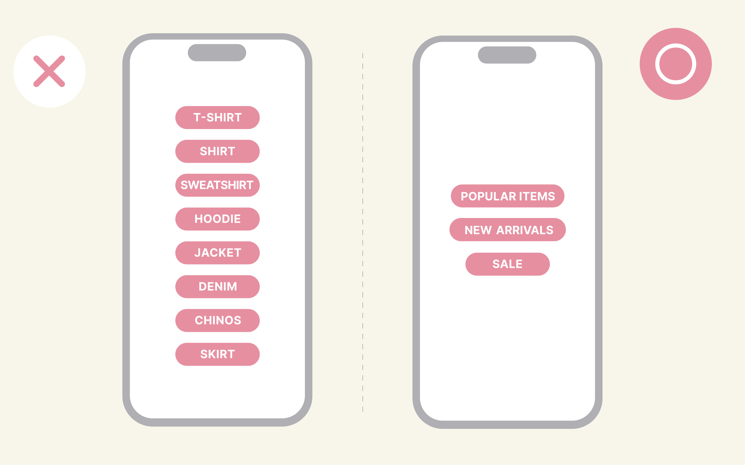
The more choices people are given, the longer it takes them to decide.
This shows that more information ≠ more helpful.
Especially in first-time experiences, too many options can lead to a feeling of difficulty and confusion.
🎵 Practical Examples: Break forms into steps / Simplify navigation
🪄 Best Used For: Designing e-commerce categories, organizing menu structures
2. Zeigarnik Effect
Unfinished tasks stick in our minds.
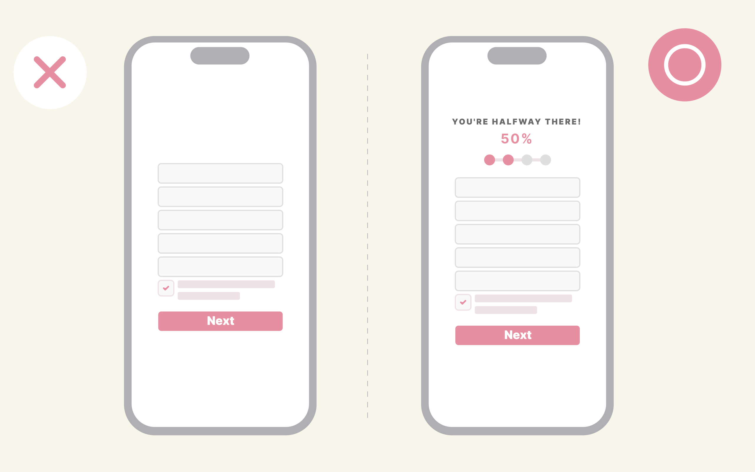
People tend to remember tasks they’ve started but not completed, while completed tasks are more likely to be forgotten.
In UI, this effect can be used to make users feel compelled to continue where they left off.
🎵 Practical Examples: Step-by-step UI (progress bars, to-do lists)
🪄 Best Used For: Account sign-ups, profile completion, learning apps
3. Yerkes-Dodson Law
Optimal performance occurs with moderate pressure.
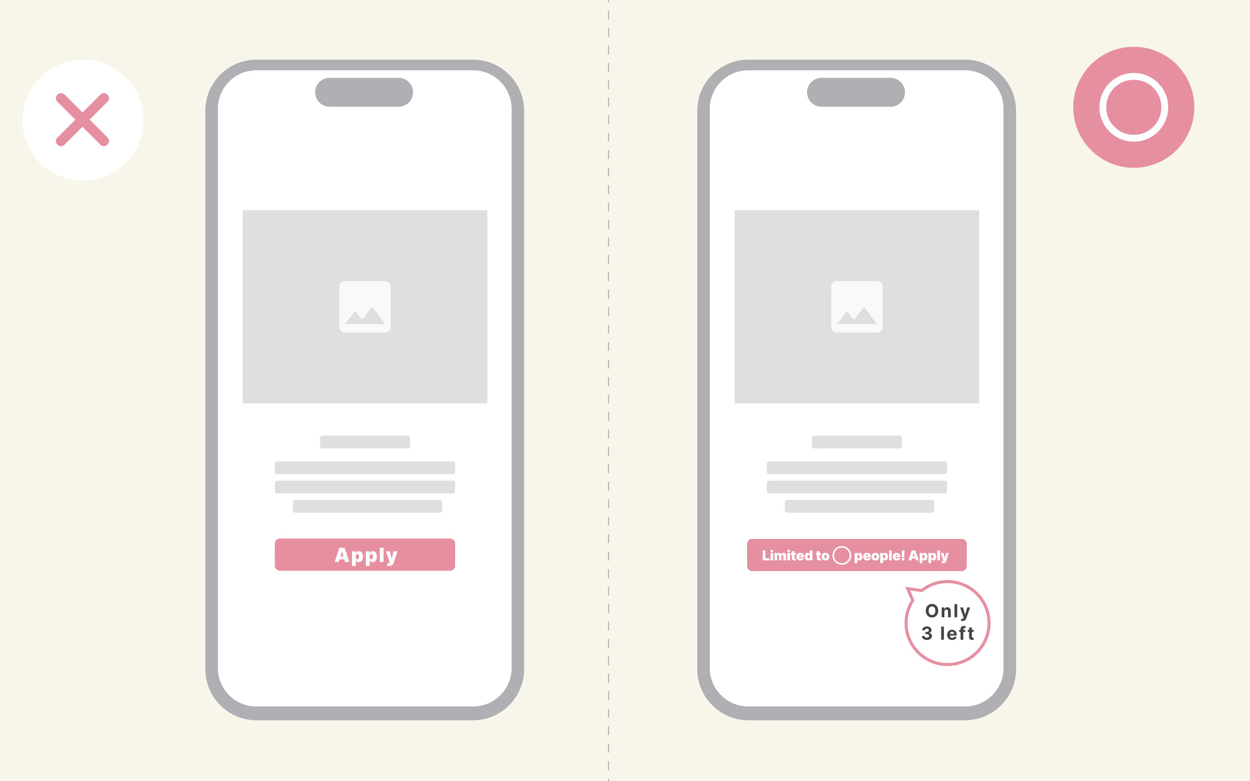
Too much or too little pressure can demotivate users.
A sense of urgency or exclusivity can encourage action.
🎵 Practical Examples: Use copy like “Limited offer” or “Only 3 left” on CTAs
🪄 Best Used For: Campaign promotion, reducing barriers to first-time sign-ups
4. Miller’s Law
We can only process 7±2 pieces of information at once.
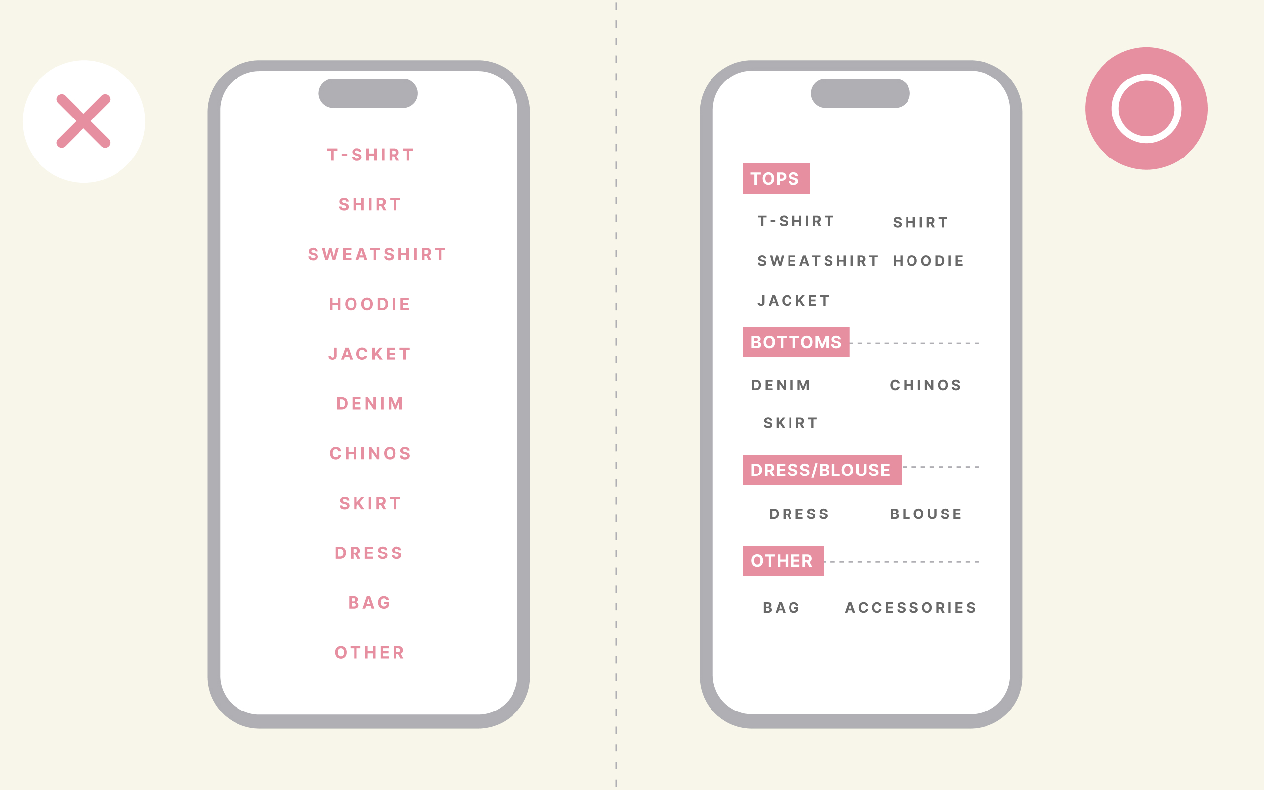
Our short-term memory has limits.
Overloading a UI with information increases cognitive load and leads to drop-offs.
Always focus on limiting and grouping information.
🎵 Practical Examples: Limit menus to 5–7 items / Restrict elements per screen
🪄 Best Used For: Onboarding flows, form layouts, organizing information cards
5. Priming
How you present information changes what people choose.
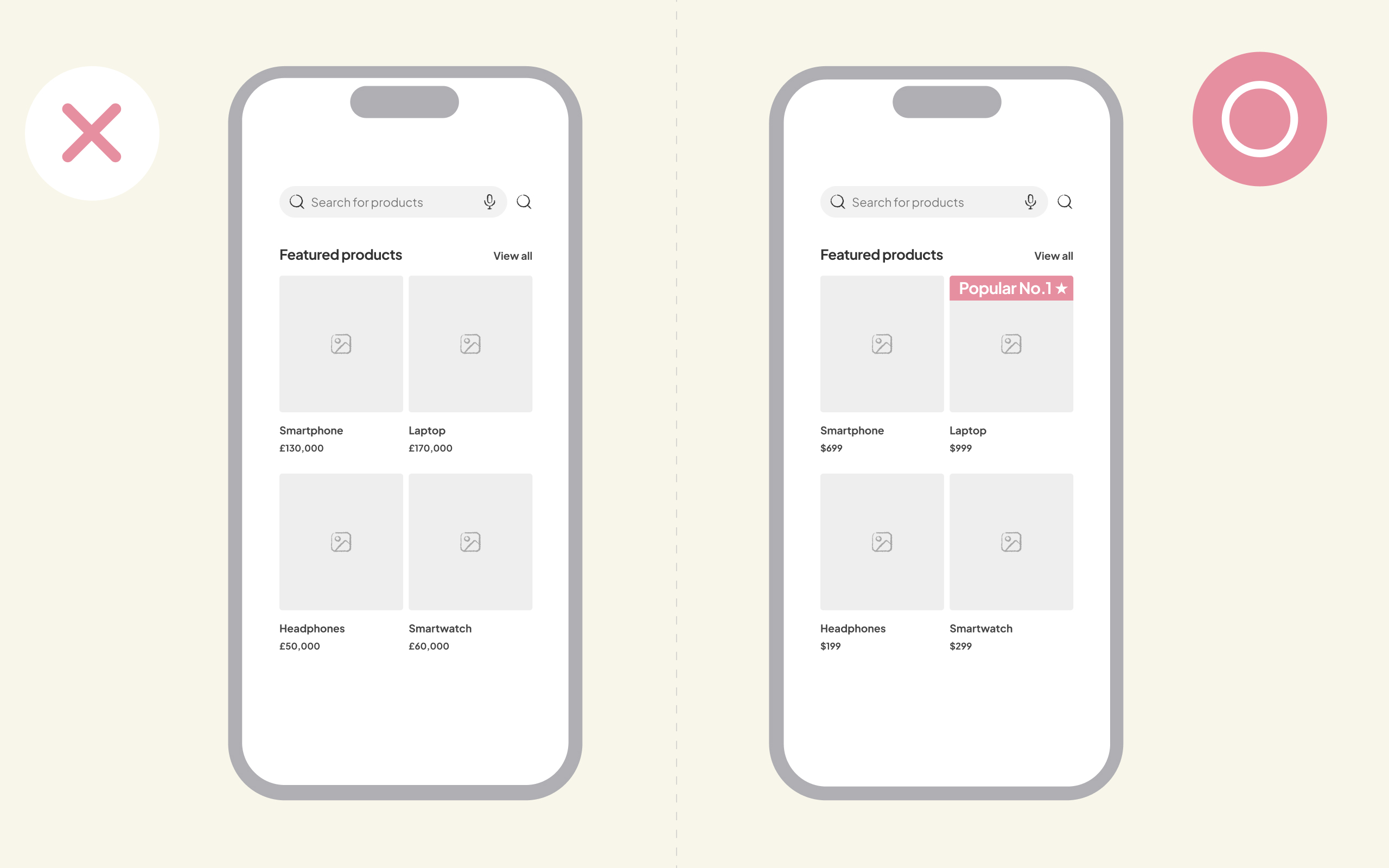
Priming refers to how prior exposure influences decision-making.
Labeling a product as “No.1 Best Seller” makes it more likely to be chosen.
🎵 Practical Examples: Use badges like “Recommended” or “Popular”
🪄 Best Used For: Pricing tables, review displays, product comparison pages
6. Commitment and Consistency
People want to justify their own actions.
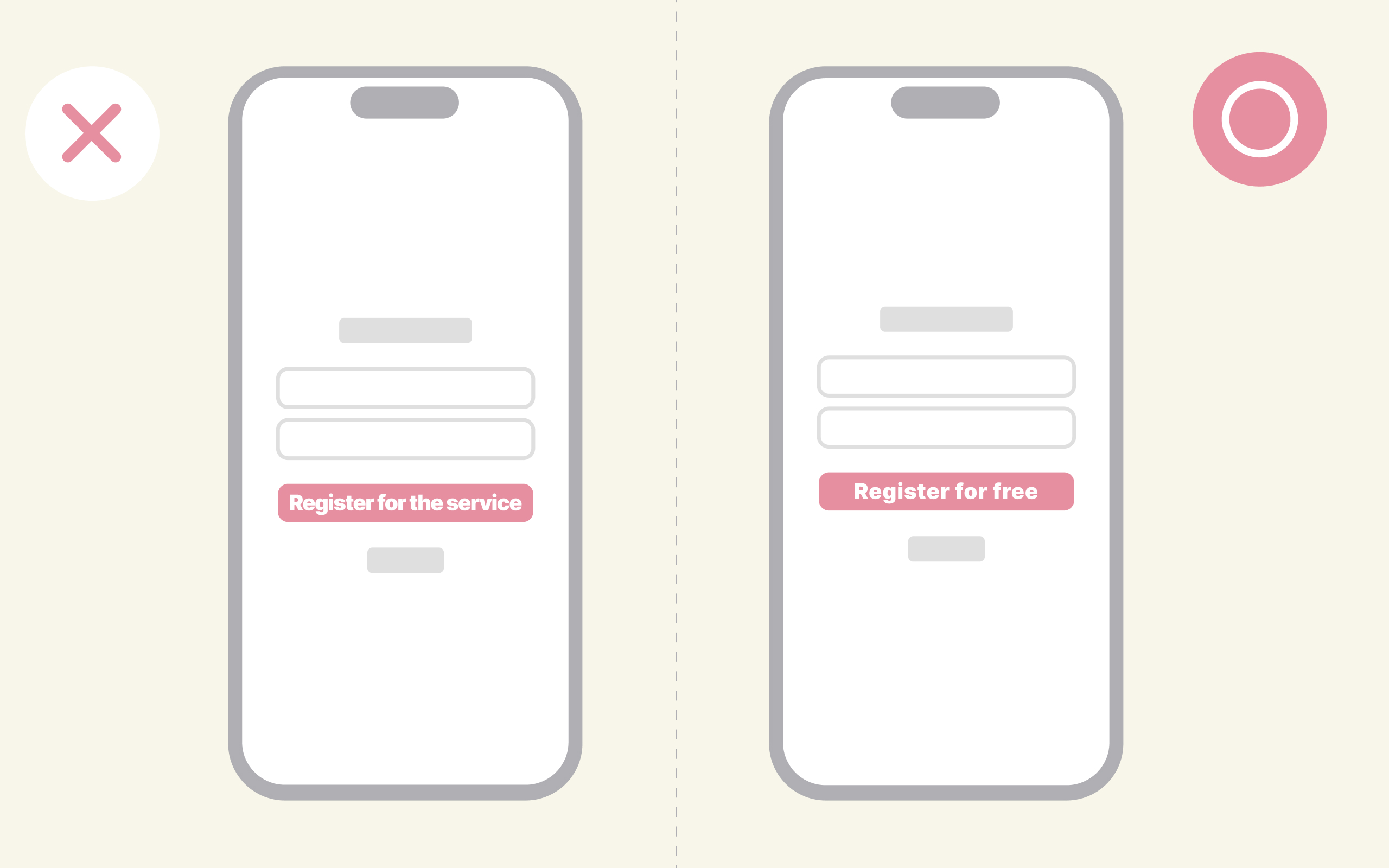
Once someone takes an action, they tend to act consistently with that decision.
Small actions like “Sign up” or “Add to Favorites” can lead to long-term engagement or subscriptions.
🎵 Practical Examples: Start with small commitments (e.g., free sign-up)
🪄 Best Used For: Increasing LTV, designing subscription-based services
7. Mirroring
Use language and expressions from the user’s perspective to make them feel it’s “designed for me.”
Reflecting users’ language and behavior in your UI helps them feel that the product is tailored to their needs.
This turns actions into meaningful behaviors, making engagement more likely.
🎵 Practical Examples: Conduct user testing or heuristic evaluations
🪄 Best Used For: UI improvement projects, team design reviews
Conclusion
Great UX is born from understanding the human mind.
Psychology helps us turn “intuitively easy to use” into a shared, repeatable framework.
These 7 psychological principles are valuable not only for UI designers, but also for PMs and engineers.
Instead of relying solely on intuition, try designing with a mindset of “science for the human mind.”
Could the “right” UX be hidden in psychology?
All 7 UX psychology principles we’ve introduced today are grounded in human unconscious behavior.
That’s why just applying them naturally leads to more user-friendly design.
-
Why does this UI feel good to use?
-
Why are users dropping off in this flow?
By approaching these questions from a psychological perspective, the causes become clearer—and so do the solutions.
We hope even one of these ideas becomes a helpful hint for your next design.
If you enjoyed this post, please consider giving us a follow or like!
We’d love to hear your thoughts or feedback.
Thanks for reading until the end!