Why 8px?
Hello,
We are the design team at Third Scope Europe Inc.
In the design world, one widely accepted practice is the 8px grid system.
Many designers have heard the rule:
Design layouts using multiples of 8 pixels.
But you might wonder:
Why 8px?
Why not 10px or 12px?
Behind this seemingly simple number lies a set of practical reasons that help create clean, scalable, and consistent UI designs.
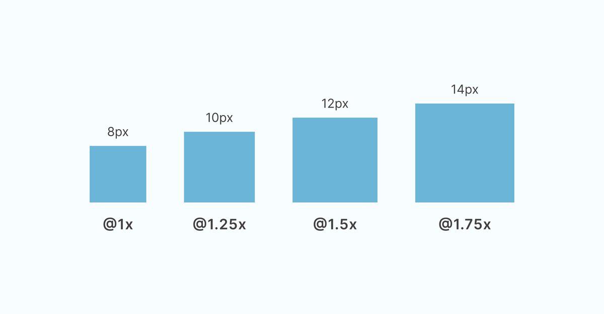
Table of Contents
- Why 8px?
- What is the 8px Grid System?
- Why 8? Three Key Reasons
- Practical Examples in UI Components
- Benefits for the Development Process
- Practical Tip: Combining 8px and 4px
- Impact on User Experience
- Starting Your Design with an 8px Grid
What is the 8px Grid System?
The 8px grid system is a design approach where all UI elements are sized and spaced using multiples of 8 pixels.
This includes:
-
element sizes
-
spacing between elements
-
padding and margins
-
layout structure
For example:
-
Button padding: 8px, 16px, 24px
-
Icon sizes: 16px, 24px, 32px
-
Text spacing: 8px, 16px, 32px
By standardizing measurements in multiples of 8, designers can create layouts that feel visually balanced and consistent.
Why 8? Three Key Reasons
1. Simple and Clean Calculations
Let’s look at how multiples of 8 behave.
Multiples of 8:
-
8 × 1 = 8
-
8 × 1.25 = 10
-
8 × 1.5 = 12
-
8 × 1.75 = 14
Now compare that with 10-based systems:
-
10 × 1.25 = 12.5
-
10 × 1.75 = 17.5
Decimal values appear quickly, which can make pixel-perfect design harder to maintain.
The 8px system avoids this issue and keeps spacing values cleaner.
2. Works Well Across Devices
Modern screens often align well with multiples of 8.
Examples:
-
1920 × 1080 → divisible by 8
-
1280 × 720 → divisible by 8
-
375 × 667 (iPhone) → partially compatible with 8-based spacing
Because of this, layouts based on an 8px grid tend to remain consistent across different screen sizes.
3. Perfect for Halving Layouts
The number 8 is divisible by 2 repeatedly, which is very useful for responsive design.
Example:
-
160px ÷ 2 = 80px
-
80px ÷ 2 = 40px
-
40px ÷ 2 = 20px
This makes it easier to divide layouts, create flexible grids, and maintain proportional spacing.
Practical Examples in UI Components
Button Design
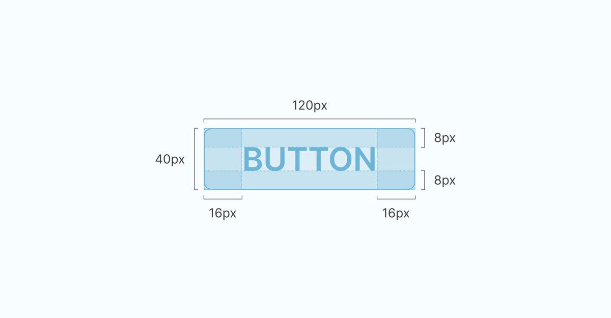
Example button structure:
-
Vertical padding: 8px
-
Horizontal padding: 16px
-
Border radius: 8px
Using multiples of 8 ensures consistent proportions regardless of button size.
Card Components
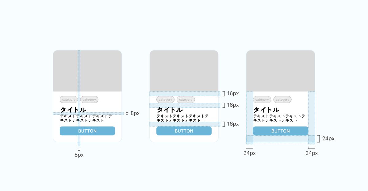
Example card layout:
-
Inner padding: 8px
-
Spacing between elements: 16px
-
Outer margin: 24px
Icon Design
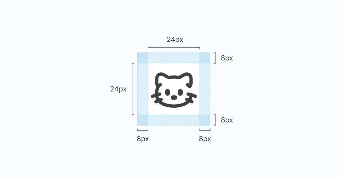
Example icon sizing:
-
Icon size: 24px × 24px
-
Vertical padding: 8px
-
Horizontal padding: 8px
Benefits for the Development Process
For Designers
-
Easier decision-making — always choose multiples of 8
-
Naturally consistent layouts
-
Faster iteration and revisions
For Developers
-
Clear implementation values
-
Fewer layout inconsistencies
-
Easier communication between designers and engineers
For Projects
-
Faster development speed
-
Reduced design implementation costs
-
More stable UI quality
The 8px grid system helps align both design and engineering workflows.
Practical Tip: Combining 8px and 4px
While 8px should be the foundation, using 4px increments can allow finer adjustments.
Recommended usage:
-
8px base → main layout spacing and sizing
-
4px adjustments → minor spacing tweaks
However, using 4px too frequently can complicate the system, so it’s best to keep 8px as the primary rule.
Impact on User Experience
The 8px grid system doesn’t just improve visual aesthetics — it also enhances usability.
Intuitive interactions
Consistent spacing helps users predict how elements behave.
Better readability
Proper spacing clarifies information hierarchy.
Stronger trust
Well-structured interfaces make products feel more reliable and professional.
Starting Your Design with an 8px Grid
Today, the 8px grid system is no longer optional.
It has become a core practice in modern UI/UX design.
What You Can Start Doing Today
-
Review existing designs using an 8px base
-
Design new components using multiples of 8
-
Share grid system rules across your design team
Expected Results
-
More consistent design systems
-
Faster collaboration between teams
-
Improved user experience
By consciously designing with the 8px grid in mind, you can create cleaner and more structured UI layouts.
If you have questions about this topic or would like us to cover other design subjects, feel free to leave a comment.